Motorway Signage
Posted: Thu 5 July, 2012 Filed under: Design, Driving, Thoughts Leave a comment »And again, some thoughts about the M1 during the works. This time, it’s about the new electronic signage…
Motorway signage (as well as other road signs) always used to be designed for clarity, so they could be read and understood at distance/speed. However, this doesn’t seem to apply so much to the latest generation of electronic signs.
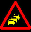
There are two in particular that are nearly impossible to differentiate at speed.
You can see the problem, I expect – in both cases, the yellow ‘information’ consists of, effectively, a triangle of colour. From a distance, you can’t tell which is which.
It’s probably not massively relevant, I suppose, as both signs indicate “You’re going to be here for a while”. But still, they’re hard to differentiate.

