#1 Dad
Posted: Wed 14 June, 2017 Filed under: 1BEM, Advertising, Creativity, Cynicism, Design, Domestic, Geeky, Marketing, People, Thoughts, Weirdness Leave a comment »Sometimes, you see something, and your brain just goes “What?!?” (or words to that effect, but with more swearing) Currently, there seems to be a theme connecting that with both Father’s Day and Star Wars.
Last year, we had the card with Kylo Ren…
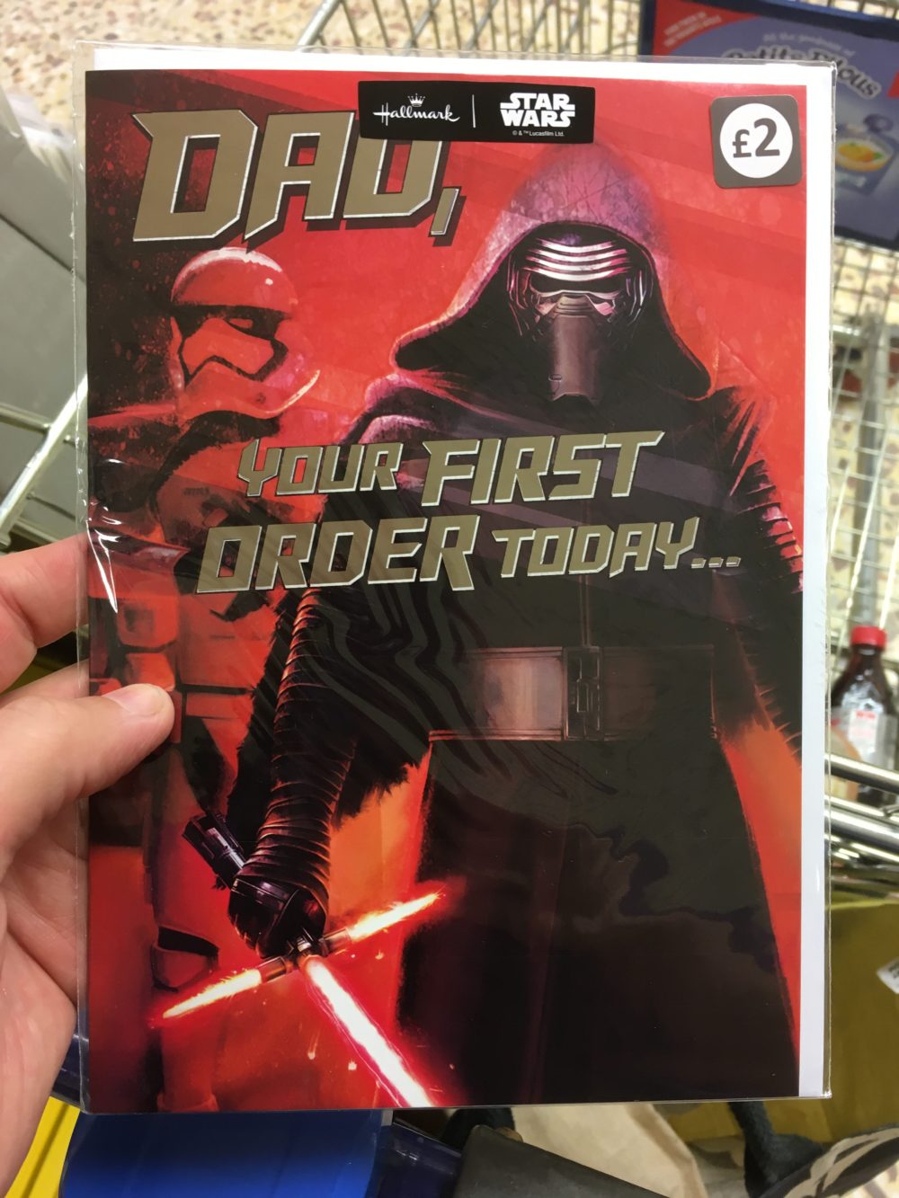
[Spoiler from two years ago – Kylo Ren kills his father]
This year, I’ve seen this in Sainsbury’s…
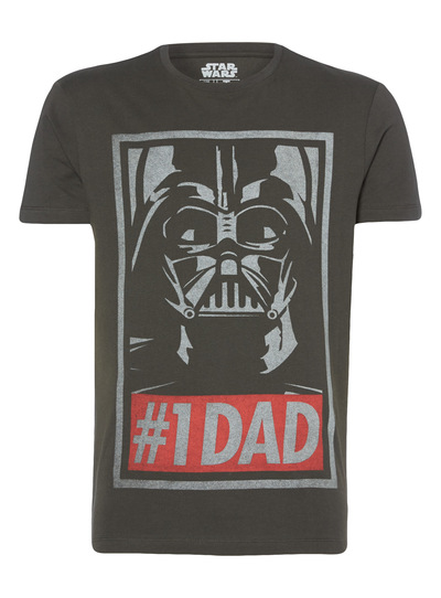
I’m pretty damn sure they haven’t seen the same Star Wars films I have…
Security Stupidity
Posted: Thu 24 March, 2016 Filed under: 1BEM, Design, Laziness, Milton Keynes, People, Security, Stupidity, Thoughts Leave a comment »Every so often, I’ll see a scenario that just leaves me utterly gobsmacked. Sadly, they’re usually based around security of some sort – for whatever reason, it’s something I’m generally pretty tuned in to, and aware of.
Yesterday’s one was an absolute blinder – and caused by a complete lack of thought/awareness.
While I was walking at lunchtime, the person in front of me was paying a bill over the phone. Using hands-free, so it was all done out loud. (I don’t quite get why some people use hands-free for conversations on mobiles while walking – particularly when they’re still holding the mouthpiece to their mouths anyway. People be weird)
That wasn’t so bad – he was entering the card details using the keypad, so in that aspect it was fairly secure. Not how I’d have chosen to do it, but hey, I’m not one to judge.
The bit where it all went tits up, though, was that the payment line then reads the numbers back to the user, as a confirmation. “If this is correct, press 1“.
It’s a scenario where the developers etc. have thought about how to confirm the card data, and it makes sense to read it back. They’ve just not seen the real-world situations where people then do these things in public, on hands-free speakers. But it meant that – were I a bad person – I’d have all of that guy’s card information (it even read back the CV2 validation number) which I could have made use of.
And in case anyone’s wondering, I did tap him on the shoulder when he’d finished the call, and explained that he really should get that card changed ASAP. If I could hear it, or if he does that on a regular basis, then the card is compromised, and it’s only fair to make him aware of it.
It’s up to him, of course – but the fact I told him his card number, expiry date, and CV2 (correctly – I really do need to get out more) certainly seemed to focus his mind somewhat…
Notebooks
Posted: Tue 8 April, 2014 Filed under: Customer Services, Design, Domestic, Geeky, Reviews(ish), Stationery, Thoughts, Work-related 2 Comments »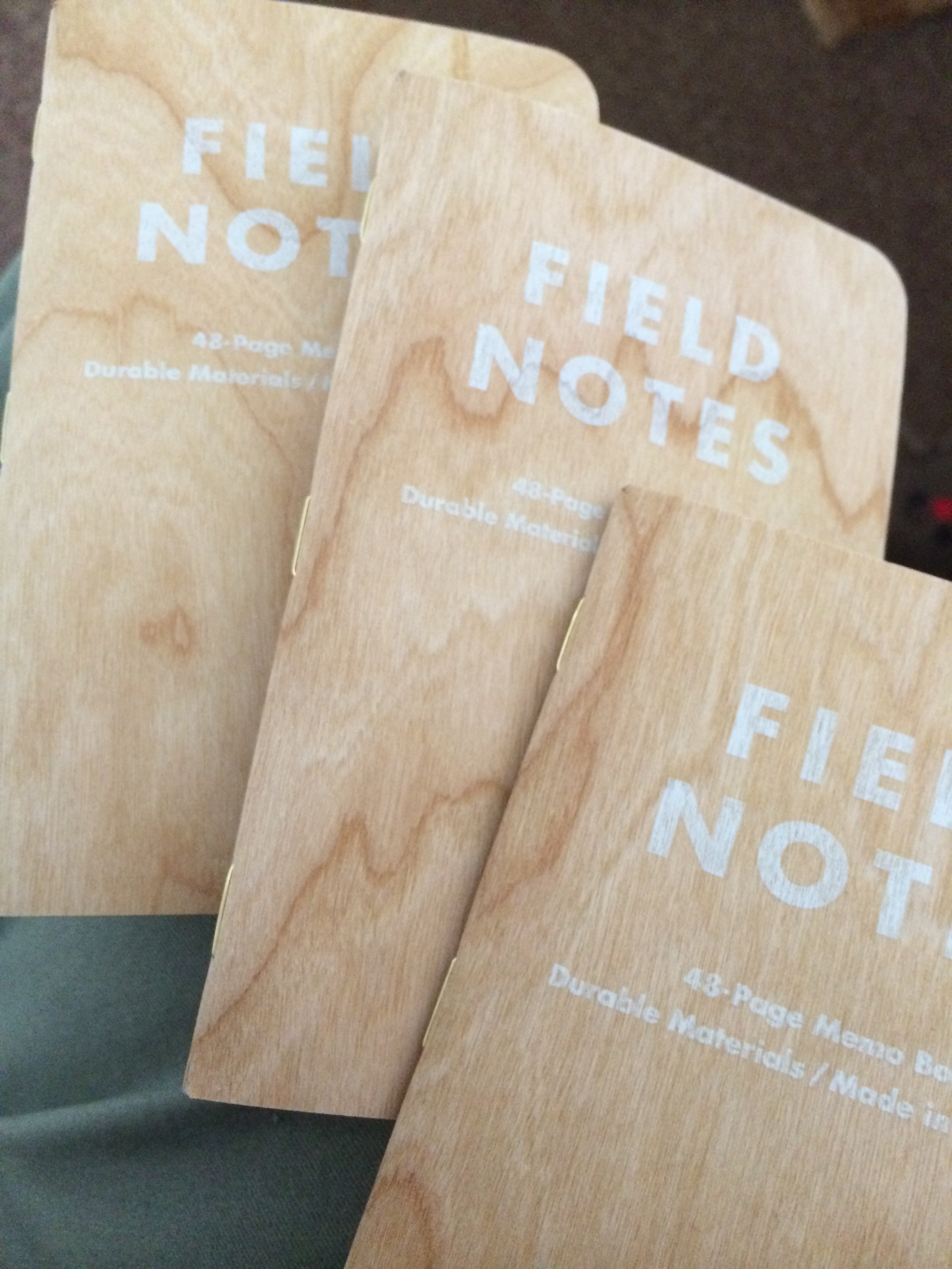 One of my loves is – as sad as it sounds – stationery. Pens, Inks, and particularly note-pads of various types. I use them a lot in my work, taking notes, keeping track of ideas and projects. Well, that’s how I justify things, anyway.
Recently I’ve been getting savage temptations from a company called Bureau Direct, who have a huge range of everything I love using. I’ve been impressed by their service, their range, and the speed and efficiency of their service. Sadly, their weekly promotional email is like temptation itself.
The most recent addition to my collection arrived over the weekend – a pack of three limited-edition “Field Notes” notebooks called “Shelterwood“.
They’ve managed to get a fine layer of American Cherry wood as the cover – I have *no* idea how they’ve managed it, but they have. The covers are still flexible, but they’re a razor-thin laminate of ‘proper wood’. Naturally, all the covers are different (as you’d expect from wood) and they’re ace. The books aren’t as big as I’d thought they might be – about A6, I’d guess – but that’s fine, and makes them different from my normal notepad-size too.
It turns out that Field Notes do these limited editions on a regular basis – I suspect I may end up with more…
Convergence
Posted: Sun 12 January, 2014 Filed under: Change, Design, Geeky, Health, Technology, Thoughts 1 Comment »Since getting the FitBit Flex, I’ve been thinking a lot about technology, innovation, and devices.
Why?
Because actually, despite being useful, the Flex feels something like a backwards step. Despite it still doing a number of things, it’s nowhere near as advanced as it could (and should) be.
Yes, this one device – worn on a strap on the wrist – can detect/monitor motion, whether that be steps, or motion during sleep. It can communicate via Bluetooth with my phone. But really that’s about it. It’s not got GPS to show where I’ve been, it’s not got a display for showing time, heart-rate, or anything else. In essence, it’s a pretty dumb device.
How has this happened? I remember back in the late 80s and early 90s when Casio were bringing out watches galore, and they could do so much more than the Flex. Casio’s corporate history is amazing for the number of innovations and firsts. Their first databank watch was made in January 1984, their first watch with GPS was released in June 1999. Within that time they certainly made watches with thermometers, weather predictions, heartrates, and many others.
So why are we now in some ways less advanced than these watches of 20-odd years ago? Why can’t my Flex also display the time, or be able to monitor my heartrate? Casio did it 20 years ago – it just seems bizarre that we can’t get one device to do all that now.
Marketing/Branding Bollocks
Posted: Fri 13 December, 2013 Filed under: 1BEM, Advertising, Charm School, Creativity, Cynicism, Design, Marketing, Sweary, Thoughts, Work-related Leave a comment »According to this article, Pantone (they’re ‘the colour people, don’t’cha know?) have decreed that this purple is “the colour of 2014”. (And fuck off, Americans, it’s ‘colour’, not bloody ‘color’)
 Now, I like purple as much as the next person – I’d go so far as to say it’s probably my favourite colour. But
- This is not proper purple. It’s a kind of wanky lilac, at best. Hell, they’ve not even called it Purple – it’s “Radiant Orchid”, which might as well be a name made up by Dulux.
- You know, there are people who get paid for coming up with this kind of shit
- And there are people whose job it is to come up with names for paints. I truly hope they feel fulfilled and happy in their work. I’d want to be killing people.
- How the blue, blazing, fiddly fuck do you have a “colour of the year”, for shit’s sake?
All told it’s just marketing bollocks of the highest order.
Masterchef
Posted: Mon 24 September, 2012 Filed under: Design, Domestic, Food, Media, Television Leave a comment »While I like the UK Masterchef when it’s on, I find I prefer the Australian version. I don’t know exactly why, I just do.
This week, I’ve been watching it, and found a chef who actually does stuff I really want to try – if only for being really inventive and clever.
The chef is Peter Gilmore from the Quay restaurant, and he comes up with some amazing things…
Last year’s challenge was his Snow Egg
And this years was a beautiful chocolate dessert, the eight-texture chocolate cake, which I’d just love to try…