Skewing Perceptions
Posted: Tue 15 April, 2014 Filed under: 1BEM, Advertising, Cynicism, News 1 Comment »This story from Business Insider contains one of the worst (or cleverest, depending on your perspective) graphs in history.
The story is about gun deaths in Florida, and contains the graph below, created by Florida’s Department of Law Enforcement.
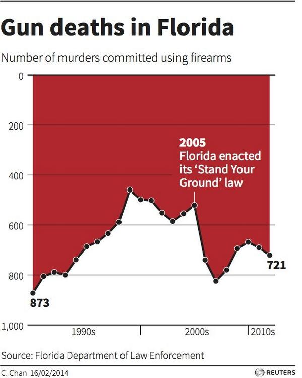
Looks like deaths went down after the “Stand Your Ground” law came in, doesn’t it?
But no, look at that Y axis on the chart (or the bold ‘totals’). The scale is upside down – so gun deaths actually increased after that law came in.
I can hear Blue Witch gnashing her teeth about that graph already…
I don’t think I’ve ever seen a graph like that. Luckily. Not into teeth gnashing. Dentist is too expensive… But, proves that if you can’t lie with the statistics, you can always alter the pictorial representation to mislead.
Hope your back is improving. If not, find yourself a good sports massage person. Much better than a physio or chiropractor IME.